In today’s era of accelerating digital transformation, organizations are faced with increasingly large volumes of data. Making sense of these complex data sets and extracting valuable insights is critically important for competitive advantage. Visual Analytics is an interactive approach that enables the analysis and interpretation of complex data sets through visual representations. This discipline combines data visualization, interactive interfaces, and analytical techniques, allowing users to more easily discover and understand patterns, trends, and relationships within data.
Core Components of Visual Analytics
Visual analytics is a comprehensive approach consisting of various components. These components work together to make the data analysis process more intuitive and effective.
Data Visualization Techniques
Data visualization is the representation of numerical data using graphs, charts, maps, and other visual formats. Various visualization techniques can be used for different data types and analysis purposes:
- Basic Charts: Common formats such as bar charts, pie charts, line graphs
- Advanced Visualizations: Heat maps, tree maps, scatter plots, parallel coordinate plots
- Geographic Visualizations: Maps, cartograms, geographic heat maps
- Time-Based Visualizations: Timelines, motion charts, flow diagrams
Effective data visualization requires selecting the most appropriate visual format considering the nature of the data and the message to be conveyed.
According to Gartner’s 2023 report, organizations using effective data visualizations report 30% faster decision-making processes compared to traditional reporting methods.
Interactive Exploration
One of the distinguishing features of visual analytics is its interactive exploration capabilities. Users can interact dynamically with data instead of being limited to static reports:
- Filtering: Ability to filter to focus on specific data subsets
- Drill-down: Ability to move from high-level summaries to detailed data
- Selection and Highlighting: Ability to select relevant data points and highlight related items
- Modification and Rearrangement: Ability to change parameters and dimensions of visualizations
These interactive features allow users to explore freely within data and gain insights without being limited to predefined paths.
Visual Querying
Visual querying is the ability to query and analyze data through visual interfaces rather than using traditional query languages (like SQL). Users can easily create complex queries by manipulating visual elements:
- Drag-and-Drop Interfaces: Creating analyses by dragging and dropping data fields
- Visual Filters: Filtering by making direct selections on graphs
- Pointer-Based Querying: Creating queries by marking specific areas on graphs
Visual querying supports data democratization by enabling even non-technical users to perform complex data analyses.
Cognitive Perception
Visual analytics leverages the powerful visual perception capabilities of the human cognitive system. The human brain can quickly process and recognize visual patterns and relationships. Effective visual analytics solutions are designed to support these cognitive processes:
- Preattentive Features: Highlighting important information using features such as color, size, and shape
- Gestalt Principles: Grouping related information using principles like proximity, similarity, and continuity
- Visual Hierarchy: Organizing information according to importance
This cognitively based approach enables users to process and make sense of large amounts of data more quickly.
Types of Visual Analytics
Visual analytics can be divided into various types that respond to different analytical needs. Each type aims to answer specific analytical questions.
Descriptive Visual Analytics
Descriptive visual analytics answers the question “What happened?” by summarizing and visualizing historical data. This type of analytics enables the understanding and explanation of past performance:
- Performance Dashboards: Dashboards that track and summarize KPIs
- Trend Visualizations: Graphs showing changes over time
- Distribution Analyses: Histograms and box plots showing data distribution
Descriptive visual analytics forms the foundation for understanding the current situation and historical performance.
Diagnostic Visual Analytics
Diagnostic visual analytics focuses on the question “Why did it happen?” aiming to discover the underlying causes of events and trends:
- Correlation Analyses: Scatter plots showing relationships between variables
- Root Cause Analyses: Fishbone diagrams or Pareto charts showing the root causes of problems
- Comparative Analyses: Charts comparing different segments or time periods
Diagnostic visual analytics helps understand the factors behind problems or successes.
Predictive Visual Analytics
Predictive visual analytics answers the question “What could happen?” by trying to predict future trends and outcomes:
- Forecast Charts: Line charts predicting future values and showing confidence intervals
- Simulation Visualizations: Charts showing the potential effects of different scenarios
- Monte Carlo Visualizations: Charts showing probability distributions and risk factors
Predictive visual analytics helps organizations shape their future plans and make proactive decisions.
According to McKinsey’s 2024 report, organizations using predictive visual analytics are 40% more successful in identifying future trends.
Prescriptive Visual Analytics
Prescriptive visual analytics answers the question “What should we do?” by helping determine the best action plan:
- Decision Trees: Tree diagrams showing different decision options and potential outcomes
- Optimization Charts: Charts helping identify optimal solutions
- Scenario Comparisons: Visualizations comparing the expected results of different action plans
Prescriptive visual analytics forms the final stage of the data-driven decision-making process and enables the identification of the most effective actions.
Advantages of Visual Analytics
Visual analytics provides organizations with various advantages and can significantly improve data analysis processes.
Comprehensibility of Complex Data
Visual analytics enables easier understanding of complex data sets. The human brain can process visual patterns more quickly and effectively than numerical data. Visual representations summarize large amounts of data, allowing users to grasp the main message more quickly.
Easy Detection of Patterns and Trends
Visual analytics enables easier detection of patterns, trends, and outliers within data. Graphs and other visual representations reveal relationships and patterns that might be hidden in numerical tables. This helps organizations detect opportunities and threats more quickly.
Data Democratization
Visual analytics tools enable even non-technical users to perform complex data analyses. Intuitive interfaces and interactive visualizations make data analysis more accessible. This democratization encourages the spread of a data-driven decision-making culture throughout the organization.
Rapid Decision Making
Visual analytics accelerates decision-making processes. Interactive visualizations allow users to quickly explore and evaluate different scenarios. The visual presentation of data enables faster understanding of insights and quicker decision making.
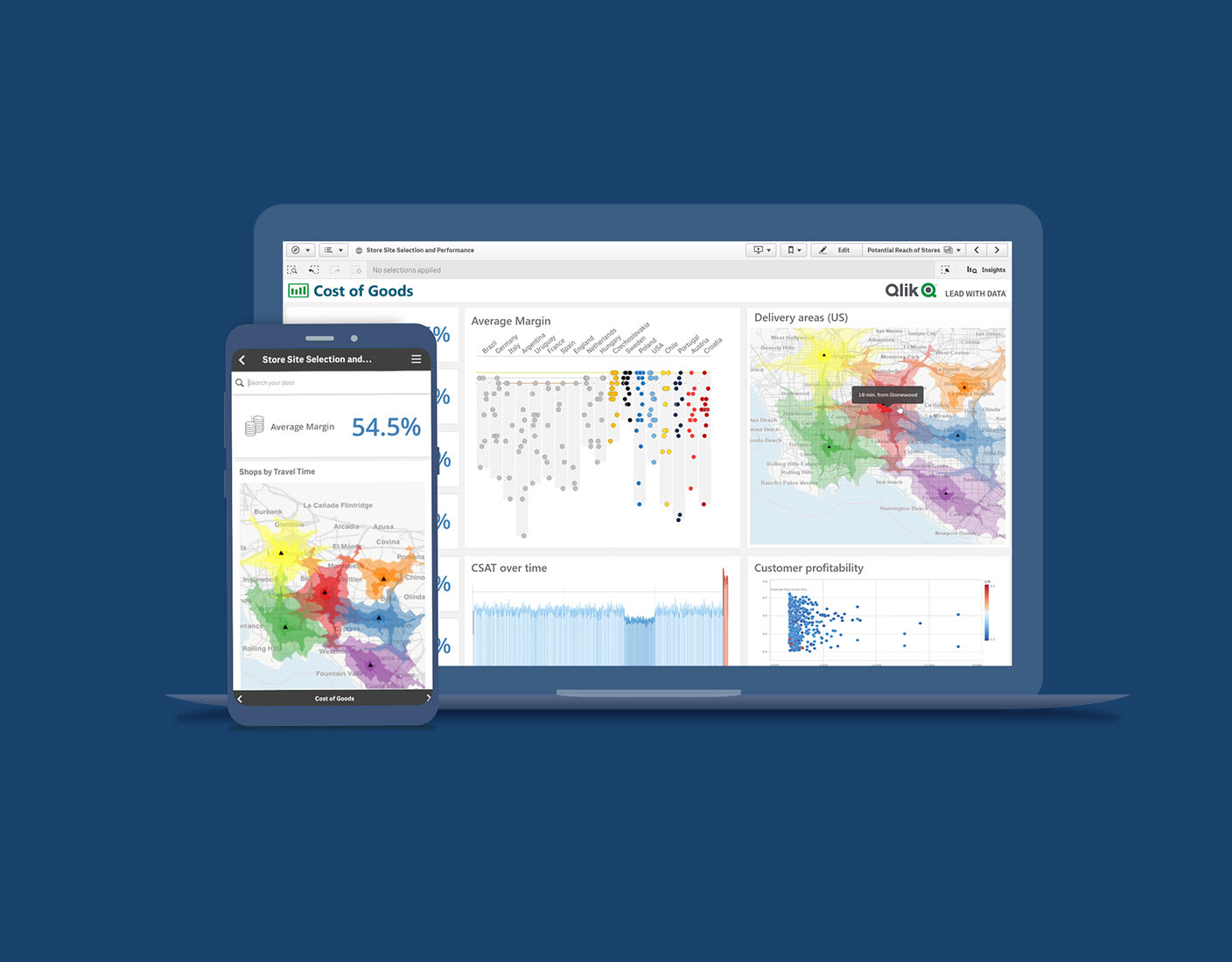
Visual Analytics Solutions with Qlik
Qlik is a leading technology provider in the field of visual analytics. Qlik’s unique approach and comprehensive solutions help organizations maximize their data potential.
Qlik’s Unique Visual Analytics Approach
Unlike traditional BI tools, Qlik offers a unique approach that allows users to interact with data without being limited to predefined paths. Qlik’s philosophy enables you to “follow your questions” rather than “follow the data.”
Associative Data Model
Qlik’s patented Associative Data Model preserves relationships between data, enabling users to perform unlimited exploration. Unlike query-based BI tools, this model allows users to discover relationships between data and uncover hidden insights:
- Associative Exploration: When users make a selection, all related data is instantly highlighted, and unrelated data is shown in gray
- Cross-Relationship Exploration: Relationships between different data sources are automatically preserved
- Smart Search: Finding relevant connections and relationships by searching across all data
Interactive Visualizations
Qlik offers rich and interactive visualization capabilities:
- Rich Visualization Library: A wide range of options from basic charts to advanced visualizations
- Drag-and-Drop Interface: Creating and customizing visualizations without writing code
- Dynamic Visualizations: Visualizations that update instantly according to user selections
- Customization Options: Customizing features of visualizations such as color, size, and labels
Self-Service Analytics
Qlik’s self-service analytics features enable users to perform their own analyses without depending on the IT department:
- Data Preparation: Enabling users to perform data preparation and transformation
- Analysis Creation: Creating analyses and visualizations with drag-and-drop interface
- Exploration and Querying: Performing data exploration and querying with interactive visualizations
- Content Creation: Creating and sharing dashboards and reports
Challenges in Visual Analytics Applications and Solution Proposals
Visual analytics applications may encounter various challenges. Understanding and proactively addressing these challenges is critical for a successful visual analytics strategy.
Data Complexity
The complexity of modern data ecosystems brings challenges in integrating and analyzing data from different sources. Numerous variables and complex relationships can make it difficult to create effective visual representations.
Solution Proposal: Qlik’s Associative Data Model seamlessly integrates different data sources, ensuring the preservation and visualization of complex data relationships. Additionally, advanced visualization techniques (such as heat maps, parallel coordinate plots) can help represent complex data sets more effectively.
Visual Design Challenges
Effective visual design requires technical skills and aesthetic understanding. Poorly designed visualizations can lead to misinterpretations or missing important insights.
Solution Proposal: Qlik’s visualization best practices and templates can help users create effective visualizations. Additionally, Qlik’s automatic visualization suggestions recommend the most appropriate visualization formats based on data type and analysis purpose, simplifying the design process.
User Competency
Effective use of visual analytics tools requires a certain level of data literacy and analytical thinking. Users’ lack of these skills can prevent the full potential of visual analytics solutions from being realized.
Solution Proposal: Qlik’s user-friendly interface makes it easier for even non-technical users to perform visual analysis. AI-powered features like Qlik Insight Advisor simplify analytical processes by providing users with automatic insights. Additionally, regular training programs and community resources can help users develop their data literacy and analytical skills.
The Future of Visual Analytics
The field of visual analytics is rapidly evolving with technological developments. Some important trends that will shape this field in the coming years include:
Artificial Intelligence Integration
Artificial intelligence and machine learning will be increasingly used to automate and enhance visual analytics processes. AI-powered visual analytics features may include:
- Automatic Insight Discovery: AI algorithms automatically detect and present important patterns and trends within data
- Intelligent Visualization Recommendations: The most appropriate visualization formats are recommended based on data type and analysis purpose
- Natural Language Processing: Users can ask questions in natural language, and AI transforms these questions into appropriate visualizations
AI-powered features like Qlik’s Insight Advisor are pioneers of this trend.
Augmented and Virtual Reality
Augmented reality (AR) and virtual reality (VR) technologies will add new dimensions to visual analytics. These technologies can enable more immersive and interactive visualization of data:
- 3D Data Visualizations: Exploring complex data sets in three dimensions
- Immersive Data Experiences: Users can “walk” within data in virtual environments
- Collaborative Analysis: Users in different locations can perform data analysis in the same virtual environment
These technologies can offer new possibilities, especially in the analysis of complex, multi-dimensional data sets.
Natural Language Processing Integration
The integration of natural language processing (NLP) technologies into visual analytics platforms will enable users to interact with data in a more natural way:
- Natural Language Queries: Users can ask questions in natural language instead of technical query languages
- Automatic Narrative Generation: Visualizations can be automatically supported with natural language narratives
- Voice Commands: Users can control visualizations with voice commands
Qlik’s natural language processing capabilities allow users to have more intuitive interactions with data.
Conclusion
Visual Analytics is a powerful approach that enables organizations to derive valuable insights from complex data sets. By combining data visualization, interactive exploration, and cognitive perception principles, it makes data more understandable and actionable.
Qlik’s comprehensive visual analytics solutions help organizations maximize their data potential with the Associative Data Model, rich visualization capabilities, and self-service analytics features. These solutions encourage data democratization by enabling even non-technical users to perform complex data analyses.